Thursday, December 12, 2013

Final Critique


1.EDIT-1666.jpg  by Katie Purgay 
    
   The long exposure of this photo allows the water to have continuous movement, making it appear very soft. This is highlighted by the focused detail of the ice on top of the moving water. The ice stands out because of its clarity, and appears as if it is floating and separate from the fog like water beneath it. I think making this photo black and white was a wise choice because it added an additional contrast between the ice and water, while highlighting the details of the ice. 
  1. IMG_4201.jpg  by Shelby Jurewicz

This photo is very compelling to me. I find the dark figures of the bison to draw my eye, while their formation of their straight line moves me from the left side of the frame across to the right. This horizontal movement is highlighted by the strong horizon line that is established. I think it is also a nice touch that the falling snow has been captured, making the moment seem more natural. I also like this photo because it is black and white, which makes the bison stand out and become the focus of the photo. 


  1. YNP-5350.jpg by Nancy Robinson 

I think this photo is a strong piece because the highest peak of the mountain is placed well within the frame with consideration of the rule of thirds. The photo is very clear and shows a good depth of field. I think this photo is also unique because the crisp reflection is broken up by the ice, which is not a very common photo. I also like that she chose to leave the branches in the foreground which contributes to developing the 7 layers of the photo. The water is also about 2 shades darker than the sky as it should be. 

  1. edit-0679.jpg by Kris Musser 

This photo leads the viewer’s eye into the frame with the rocks on the lower right hand side and the distinct lines created by the snow. The framing of the scene also shows a knowledge of the rule of thirds. The bright blue hues in the photo are very attention grabbing and the whole photo appears to have an appropriate depth of field. I like how the fog helps to define the horizon line. 


  1. sun+set.jpg by Noah Kirui

  I really like the subtle pink hues throughout the photo and how they contrast with the green. I wish that an adjustment was made to the aperture to show a greater depth of field. I like the leading lines created by the clear blades of grass in the foreground. The repetition of colors allows for the different layers to to transition smoothly, and a strong horizon line is established. I really enjoy the lines created by the reflection in the water as well. 

  1. EDIT-1580.jpg by Katie Purgay 

I was quite amazed by this photo when I first saw it. I was immediately both impressed by its originality and quality. She was able to keep the large feature in focus while capturing the vibrance of the night sky. I also enjoy the strong horizon line created by the dark silhouette of the trees. I also find the glowing green colors in the midground to be very intriguing. 

  1. 208.JPG by Stina Foiles 
I really like that the single spiral is the only thing left in focus. The colors are also very vibrant and appealing to the viewer. I think that her settings were spot on to achieve this macro photo. The details of this unique part of nature keep my eye moving about the frame even though it is not all in focus. The branches in the foreground help to establish leading lines.

  1. IMG_2752.jpg 

I like the eerie yet calm feeling this photo gives me. I think it is very impressive that they were able to capture the variations in brightness created by the moon and the the clouds. The moon is quite in focus which i also find impressive. I wish I could be more sure of what settings were used for this photo as I haven’t had much luck when trying to take pictures of the moon myself. 

  1. IMG_2515.jpg by Michael Eggen 

I like how abstract this photo is. The blurriness creates a lot of interesting and appealing lines. This is emphasized by the various bright colors. I find the strong and more in focus mountains the be the attention of the photo, as it establishes a strong horizon line. 

  1. IMG_20131026_081210_654.jpg by Michael Eggen 
I like the large expanse of sky in this photo. I find the mountains of in the distance to be a nice surprise that really draws the eye through the depth of the frame. There is a lot of nice contrast with the dark and stones in the foreground and the bright sky. 

Thursday, December 5, 2013

Art Show Submission


Exposure Time: 1 / 200
Flash: Flash did not fire, auto mode
FNumber: 5.6
Focal Length: 55
ISO Speed Ratings: 200

Final Presentation

All photos were taken with an Olympus E-620 and either a 14-42mm or 40-150mm lens.


1. Exposure Time: 1 / 3999
Flash: Flash did not fire
FNumber: 4.4
Focal Length: 61
ISO Speed Ratings: 800


2.Exposure Time: 1 / 3999
Flash: Flash did not fire
FNumber: 4.7
Focal Length: 79
ISO Speed Ratings: 800


3.Exposure Time: 1 / 1999
Flash: Flash did not fire
FNumber: 5.6
Focal Length: 150
ISO Speed Ratings: 1000


4. Exposure Time: 1 / 640
Flash: Flash did not fire
FNumber: 4.5
Focal Length: 40
ISO Speed Ratings: 640


5. Exposure Time: 1 / 249
Flash: Flash did not fire
FNumber: 5.6
Focal Length: 150
ISO Speed Ratings: 1250


6. Exposure Time: 1 / 6
Flash: Flash did not fire
FNumber: 5.4
Focal Length: 132
ISO Speed Ratings: 800


7. Exposure Time: 1 / 10
Flash: Flash did not fire
FNumber: 11
Focal Length: 86
ISO Speed Ratings: 250


8. Exposure Time: 1 / 10
Flash: Flash did not fire
FNumber: 20
Focal Length: 40
ISO Speed Ratings: 160


9. Exposure Time: 1 / 10
Flash: Flash did not fire, auto mode
FNumber: 22
Focal Length: 40
ISO Speed Ratings: 100


10.Exposure Time: 1 / 1000
Flash: Flash did not fire, auto mode
FNumber: 5
Focal Length: 98
ISO Speed Ratings: 200


11.Exposure Time: 1 / 3999
Flash: Flash did not fire, auto mode
FNumber: 4
Focal Length: 40
ISO Speed Ratings: 1000


12. Exposure Time: 1 / 1999
Flash: Flash did not fire, auto mode
FNumber: 4.9
Focal Length: 90
ISO Speed Ratings: 250


13. Exposure Time: 1 / 3999
Flash: Flash did not fire, auto mode
FNumber: 4.5
Focal Length: 64
ISO Speed Ratings: 250


14. Exposure Time: 1 / 25
Flash: Flash did not fire, auto mode
FNumber: 13
Focal Length: 150
ISO Speed Ratings: 100


15. Exposure Time: 1 / 1999
Flash: Flash did not fire, auto mode
FNumber: 7.1
Focal Length: 137
ISO Speed Ratings: 1600


16. Exposure Time: 1 / 1999
Flash: Flash did not fire, auto mode
FNumber: 7.1
Focal Length: 114
ISO Speed Ratings: 1000


17. Exposure Time: 1 / 1250
Flash: Flash did not fire, auto mode
FNumber: 5.6
Focal Length: 150
ISO Speed Ratings: 320


18. Exposure Time: 1 / 400
Flash: Flash did not fire, auto mode
FNumber: 7.1
Focal Length: 70
ISO Speed Ratings: 200


19.Exposure Time: 1 / 249
Flash: Flash did not fire, auto mode
FNumber: 6.3
Focal Length: 150
ISO Speed Ratings: 200


20. Exposure Time: 1 / 249
Flash: Flash did not fire, auto mode
FNumber: 6.3
Focal Length: 150
ISO Speed Ratings: 200


21. Exposure Time: 1 / 40
Flash: Flash did not fire, auto mode
FNumber: 13
Focal Length: 90
ISO Speed Ratings: 100


22. Exposure Time: 1 / 100
Flash: Flash did not fire, auto mode
FNumber: 5.5
Focal Length: 137
ISO Speed Ratings: 320


23. Exposure Time: 1 / 125
Flash: Flash did not fire, auto mode
FNumber: 5.6
Focal Length: 150
ISO Speed Ratings: 400


24. Exposure Time: 1 / 40
Flash: Flash did not fire, auto mode
FNumber: 13
Focal Length: 55
ISO Speed Ratings: 800


25. Exposure Time: 1 / 800
Flash: Flash did not fire, auto mode
FNumber: 5.2
Focal Length: 110
ISO Speed Ratings: 640


26.Exposure Time: 1 / 3999
Flash: Flash did not fire, auto mode
FNumber: 4
Focal Length: 40
ISO Speed Ratings: 1000


27.Exposure Time: 1 / 3200
Flash: Flash did not fire, auto mode
FNumber: 7.1
Focal Length: 40
ISO Speed Ratings: 1000


28.Exposure Time: 1 / 60
Flash: Flash did not fire, auto mode
FNumber: 7.1
Focal Length: 137
ISO Speed Ratings: 800


29.Exposure Time: 1 / 200
Flash: Flash did not fire, auto mode
FNumber: 7.1
Focal Length: 142
ISO Speed Ratings: 500


30. Exposure Time: 1 / 200
Flash: Flash did not fire, auto mode
FNumber: 5.6
Focal Length: 70
ISO Speed Ratings: 500

Tuesday, December 3, 2013

Photography and Psychology

I came across a very interesting article today about the relationship of photography and psychology. The article delves into the fundamental relationship between the photographer and the viewer, and establishes that a "successful" image is about communication.

The author, Ming Thein, describes the importance of this communication : "At its core, a successful image is about communication: it must tell the viewer the photographers' intended story, through an entirely and solely visual means of communication. Forget captions and titles, they inevitably get orphaned from their parent images, and thus an image must be strong enough to stand on its own and clear enough to tell the intended story without the support of text. Even more importantly, the visual portion has much more immediate impact than the text -- simply because text requires conscious processing; images don't." 

Thein explores the elements of a photo that make this communication with the viewer possible as well as what the different elements can do. 


I look forward to the second part of this article being released.


Wednesday, November 27, 2013

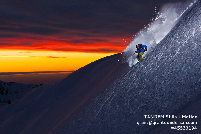
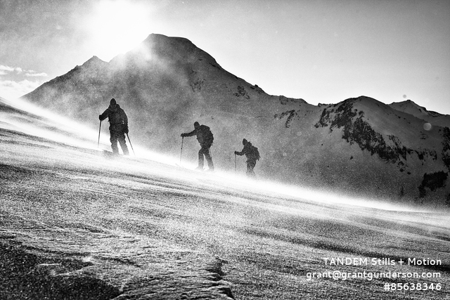
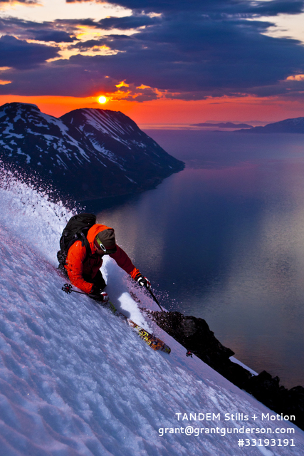
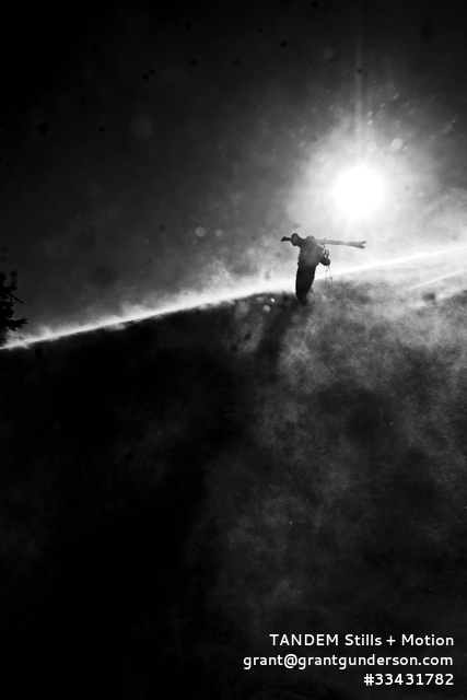
As slopes are starting to open up and it dawned on me that I haven't been snowboarding in over a year, I thought it would be interesting to find some photos of skiers and snowboarders.

I came across Grant Gunderson's website and was struck by many of his images.


I was almost surprised by these images, as they make you want to stand back and say "Wow". I found them to be very creative - it opened up a whole new view of nature photography for me. To me, they also show just how beautiful it can be when human and nature collide. 

Twitter Photographs


I came across an article on The Guardian about a case concerning photographs acquired from Twitter. 
The case is one of the first to address how images shared publicly on social media by individuals can by used by third parties for commercial puposes.
A US jury ruled in favor of freelance photographer Daniel Morel who took pictures of the aftermath of the earthquake in Haiti in 2010 and later uploaded them to Twitter. The jury ordered Agence France-Presse and Getty Images to pay a total of $1.2 million dollars for republishing the photos without Morel's permission.
This decision could become a very important to how these copyright issues caused by social media will be handled in the future. 
As an artist, this decision is comforting. I have often been told not to share my works online for fear of people claiming it as their own. 

Tuesday, November 26, 2013

Photo Critique

1. I enjoy this photograph although I find the odd angle of the ridgeline to be distracting from the main focus of the photograph - it leads my eye away from the rolling fog instead of towards it. The small building in the middle of the frame is also distracting. The colors in the photo are also distracting, as there is red in the foreground and pale blue in background with a vibrant blue in between.

2. I do not find much wrong with the photo. The squirrel's face and hands are in focus, as that is the main subject of the photo and the most important part. I think it's position in the air makes it a unique shot, as well as a humorous one. The log in the middle of the frame that is out of focus is a little distracting. I would either prefer for some of it to be in focus, or perhaps for it not to be included at all.

3. While this photo has very nice and vibrant colors, I find it to be far too blurry. The artist was able to establish a focal point on the large rocks, but the blurred clouds in the background and the shaky rocks in the foreground take away from that. This photo may be better if cropped such that the smaller, blurry rocks in the foreground were not included. The large rock on the left side would then lead the viewer's eye into the frame.